


Friedman Projects
“The corporate design is based on a lively, clear design language with circular and dot elements.”
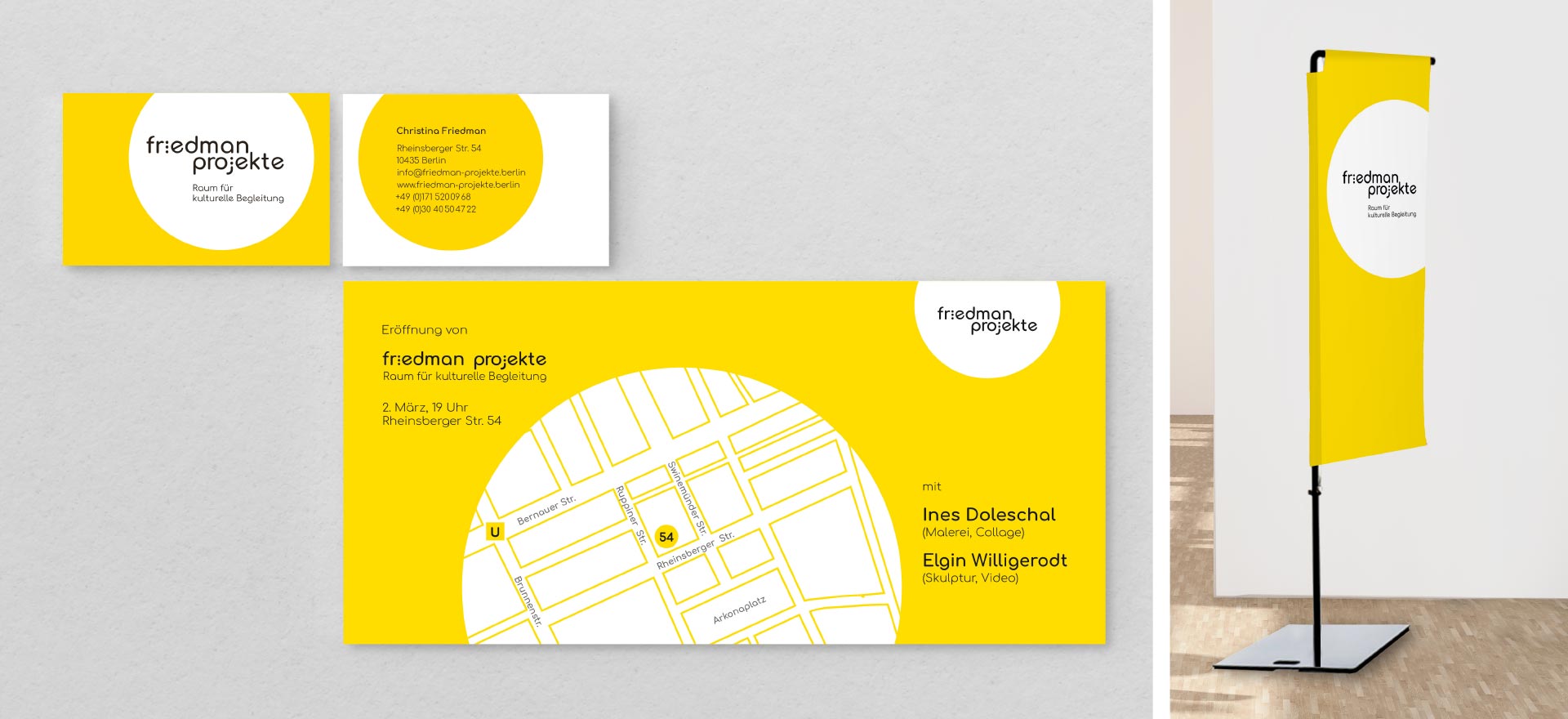
Task
The studio developed the corporate design, created a website and designed invitation cards for the project space for contemporary art. The corporate design is based on a vibrant yellow colour and a clear design language with circular and dot elements. The rounded geometric font Comfortaa complements the look.
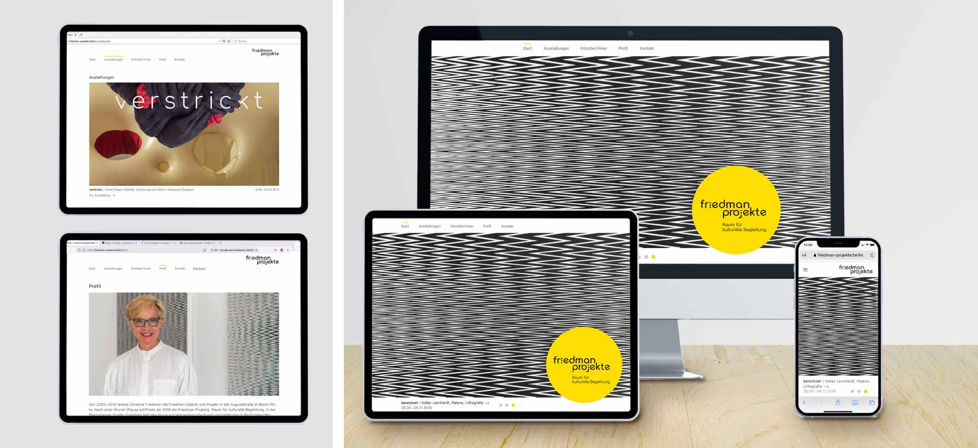
The responsive website, optimised for monitors and smartphones, offers a platform for presenting the current exhibitions and introduces the artists, project space and the director.
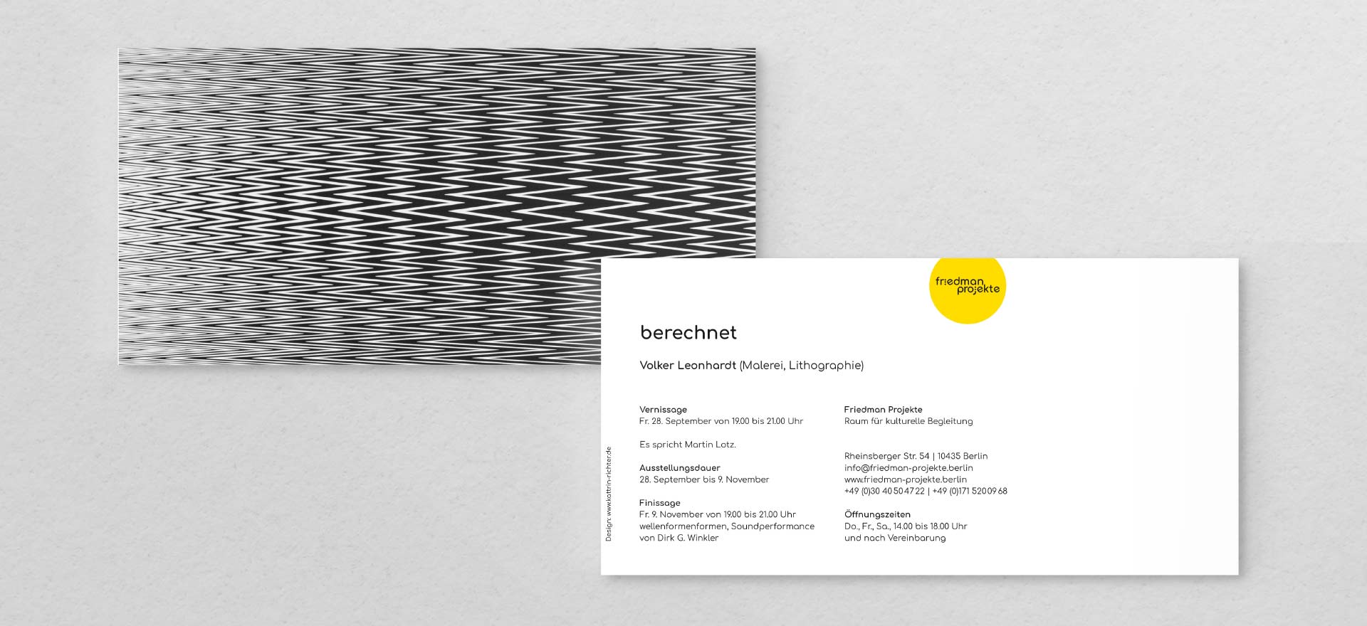
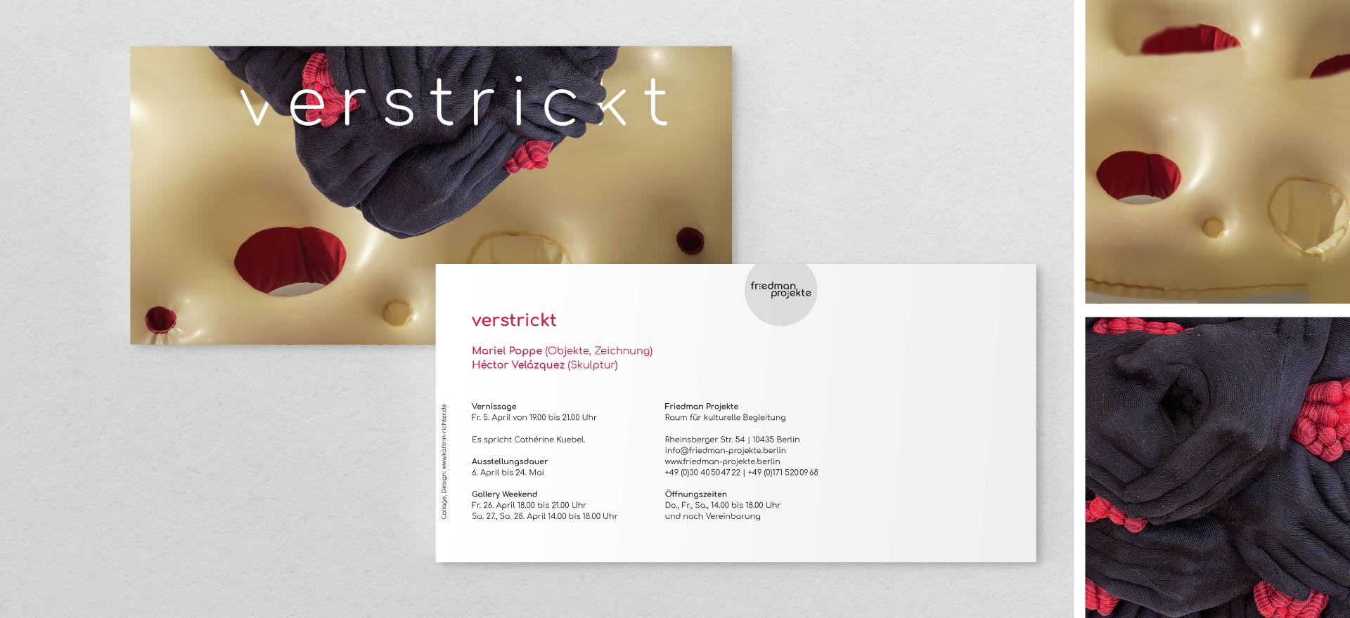
For the exhibitions “verstrickt” (“entangled”) and “entfaltet” (“unfolded”), in which two artists exhibited in dialogue with each other, the studio designed invitation cards with collages depicting the exhibited artworks. The collages show connections and opposites in the art of the two exhibitors.
Context
Christina Friedman ran the Friedman Gallery on Auguststraße in Berlin-Mitte from 2005 to 2010. After a creative break, she founded Friedman Projekte to offer artists living in Berlin a space for artistic encounters.
- Services: Design of a logo and business stationery | Website www.friedman-projekte.berlin : Concept, design and supervision of programming | Design of invitation cards for the exhibitions
- Programming of website: www.webberry-webdesign.de
- Client: Christina Friedman